Brief
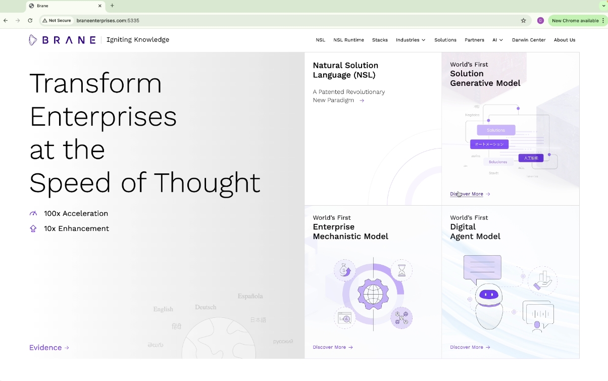
The BRANE website redesign aligns with new brand guidelines, simplifying the experience to make emerging technology and its terminology more accessible. the focus was on clear, conversational language and a minimalist visual identity featuring line art, a restrained color palette, and consistent brand tonality. the homepage highlights the company’s usp and offerings, with intuitive navigation organised by technology and business focus areas. runtime, the flagship product, is prominently featured, with direct links to detailed pages for each offering.
Solution
The redesigned website prioritizes clarity and simplicity, making advanced technology approachable for all users. a light, metaphoric visual approach enhances engagement, diverging from traditional, rigid industry visuals. the homepage anchors the user experience, presenting core value propositions and facilitating seamless navigation. this thoughtful design reflects brane’s innovative ethos, delivering a clear and compelling user experience.
Click To View
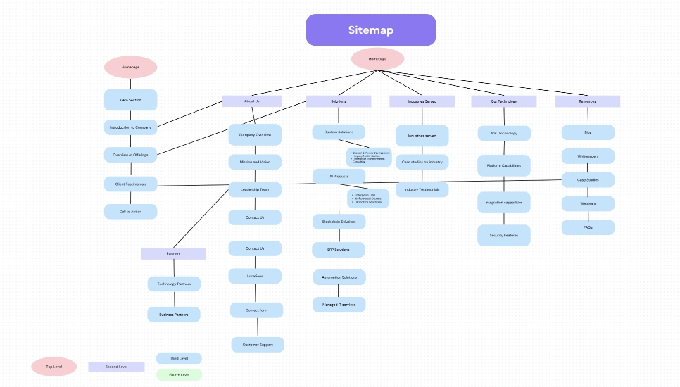
Site Map
Design Gudeline
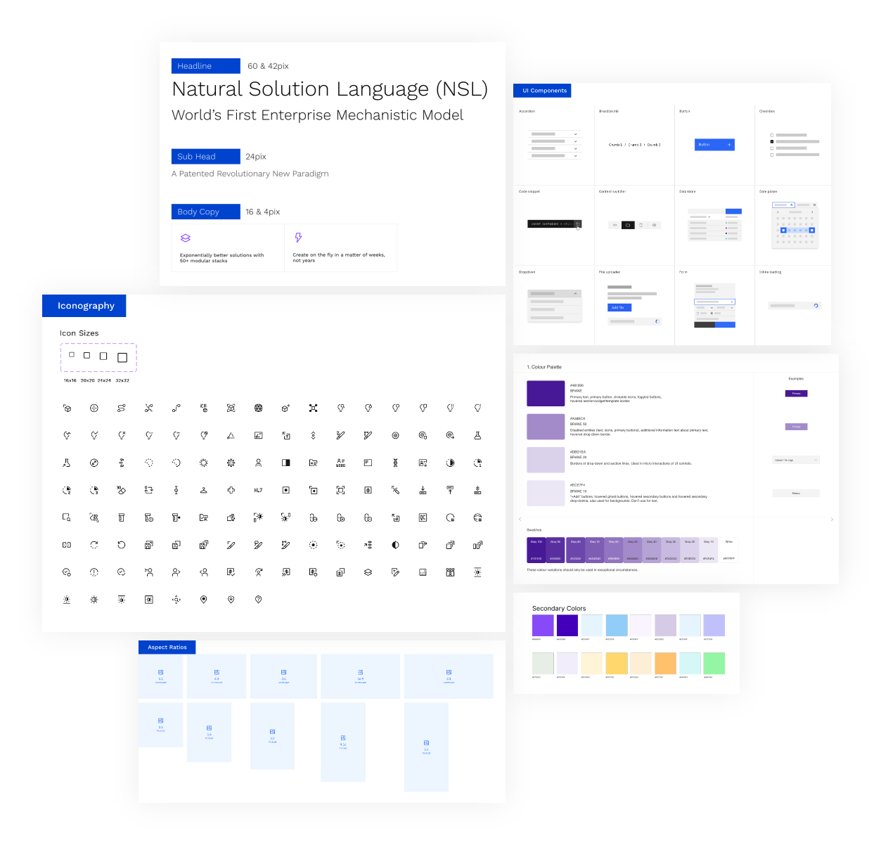
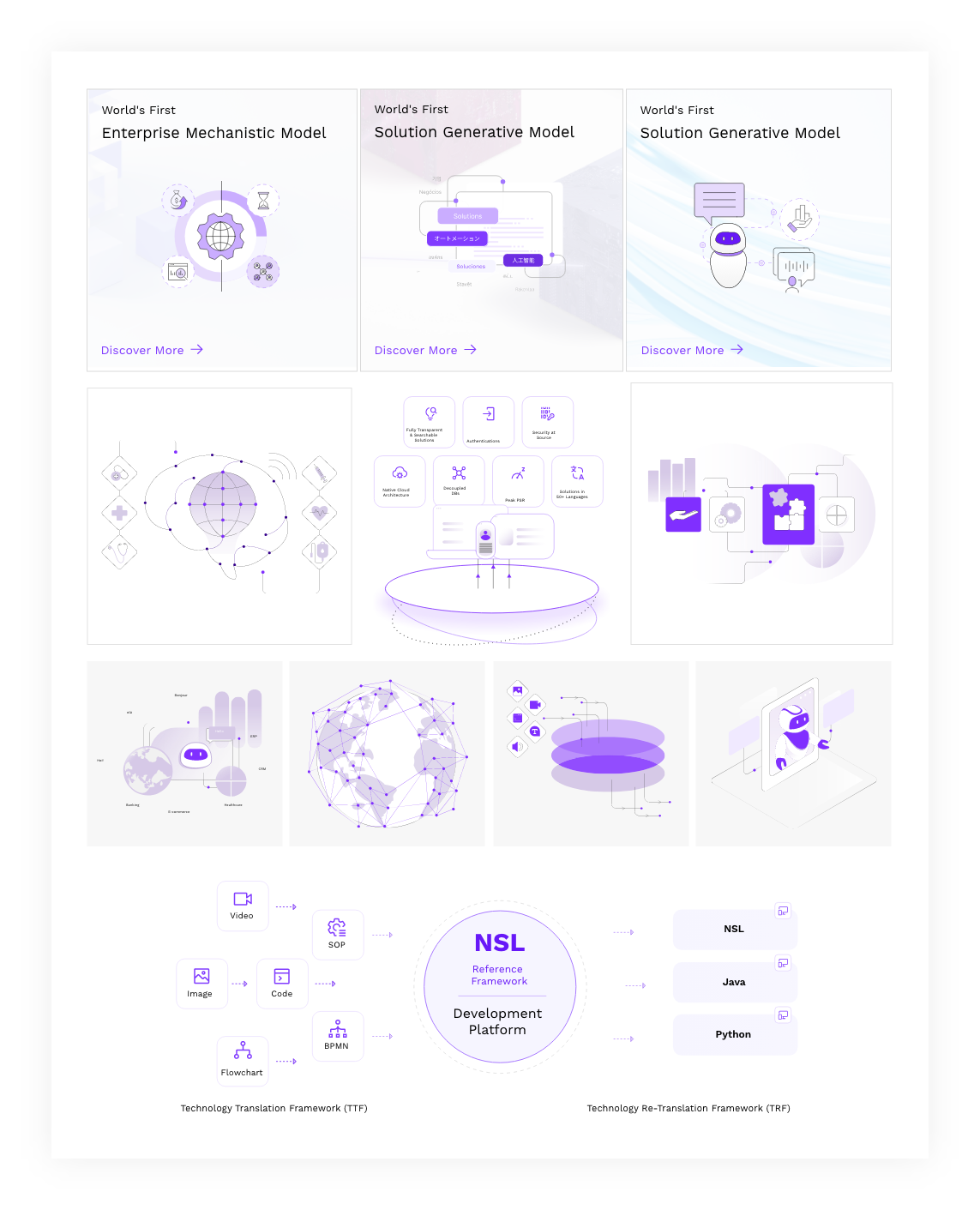
Illustrations Style
To establish a distinctive and cohesive visual identity, we developed a unique illustration style
that is simplistic, scalable, and globally adaptable.
Drawing inspiration from the natural
essence of line art, we aligned the style seamlessly with the brand identity. Much like the
illustrations found
in study materials that simplify complex concepts, we created clear
and
minimal visuals to represent different sections.
Each illustration incorporates highlighted
elements in brand colors, reinforcing recognition and consistency. This approach not only
enhances
brand recall but also differentiates BRANE in a competitive market, providing a
visual
language that is both timeless and impactful.
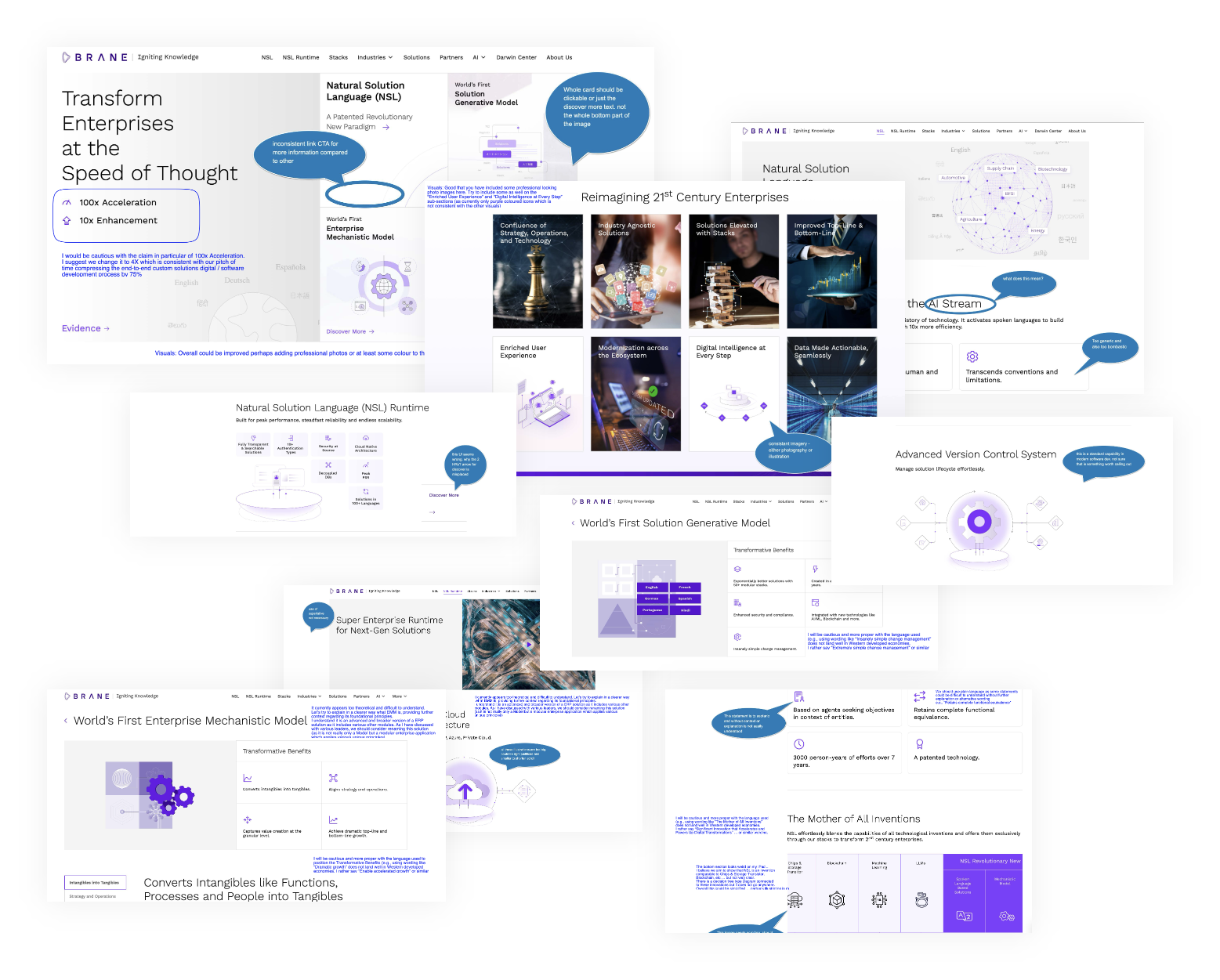
Testing Feedbacks